Sunday, April 18, 2010
Wednesday, April 7, 2010
Princeton Art Museum
The Princeton Art Museum has an impressive collection of Modern Art. Some of the most interesting paintings were from artists like Bonnard, Morandi, and more. Not only is the architecture of the building inspiring in itself, but the artworks are all from significant, successful and interesting artists.
I was surprised to see one of the Still Life paintings by Giorgio Morandi. The small-scale still life has quiet personality. The tall slender bottles are lined up near the center of the painting. The muted color palette consists of mixed grays and whites, using minimal brush strokes to describe bottles that hover in the center of the painting.
The painting entitled, Tugboat on the Siene by Pierre Bonnard is a landscape painting that is in the same room as the Morandi still life. It is painted in a somewhat impressionistic style, using the least possible brush strokes to describe the scene. In comparison to his other works, the color palette is more realistic, consisting of mostly greens and grays.
In the center of the room is Auguste Rodin’s sculpture in marble, Danaid. The glossy mound of marble stood out in the center of the mostly grey room. It portrays an idealized nude male figure curled up and placed on top of a base. It is a small-scale sculpture, and fit in perfectly with the smaller sized paintings surrounding it.
The Princeton Art Museum houses many prestigious paintings. I'm not complaining about being surrounded by the likes of Monet and being overwhelmed by PAM's extensive collection of Greek Art (borderline crowded); however, it is quite obvious that you are in Princeton when you're standing in the museum. On that note, here are some other striking paintings from the collection:
Black Friday by Willem de Kooning, Oil and enamel on pressed wood panel, 1948
Untitled by Ad Reinhardt, Oil on canvas, 1960
Untitled by Philip Guston, Oil on particle board, 1973
To see the complete collection at the Princeton Art Museum, visit:
http://artmuseum.princeton.edu
I was surprised to see one of the Still Life paintings by Giorgio Morandi. The small-scale still life has quiet personality. The tall slender bottles are lined up near the center of the painting. The muted color palette consists of mixed grays and whites, using minimal brush strokes to describe bottles that hover in the center of the painting.
The painting entitled, Tugboat on the Siene by Pierre Bonnard is a landscape painting that is in the same room as the Morandi still life. It is painted in a somewhat impressionistic style, using the least possible brush strokes to describe the scene. In comparison to his other works, the color palette is more realistic, consisting of mostly greens and grays.
In the center of the room is Auguste Rodin’s sculpture in marble, Danaid. The glossy mound of marble stood out in the center of the mostly grey room. It portrays an idealized nude male figure curled up and placed on top of a base. It is a small-scale sculpture, and fit in perfectly with the smaller sized paintings surrounding it.
The Princeton Art Museum houses many prestigious paintings. I'm not complaining about being surrounded by the likes of Monet and being overwhelmed by PAM's extensive collection of Greek Art (borderline crowded); however, it is quite obvious that you are in Princeton when you're standing in the museum. On that note, here are some other striking paintings from the collection:
Black Friday by Willem de Kooning, Oil and enamel on pressed wood panel, 1948
Untitled by Ad Reinhardt, Oil on canvas, 1960
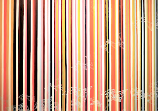
Untitled by Philip Guston, Oil on particle board, 1973
To see the complete collection at the Princeton Art Museum, visit:
http://artmuseum.princeton.edu
Tuesday, April 6, 2010
MFAII
MFA part two, MGSA, March 2010
sidenote: Sorry for posting this so late, for those of you who missed the show, you can view some images from the show on the MFA blog at http://rutgersmfa.blogspot.com
This show revealed some powerful egos as shown in the very different large paintings, sculptures, and a mix of somewhere in between the two. It is an extremely cohesive show, partially because of the color palette. It also seems completely indulgent in materiality.
Some of the most interesting artists that exhibited in this show included Brian Bulfer and Paul Demuro. Some of the works in this show frustrated and confused me, yet they seemed to work within the context of the other paintings and sculptures.
The stippled application of the paint mirrors the thick paint that appears in Paul Demuro’s paintings as well. Demuro’s work consists of extremely layered and sculptural paintings. The most intriguing piece to me is the purple painting that has the soft edges. To be frank, I could look at those paintings for a much longer, sustainable time then the paintings by Leticia Luevanos. I enjoy the indulgent aspect of the work; thinking about how much money and time it must have taken to layer that much paint is mind-boggling. Contrasting with that idea is the use of metallic paint. I enjoy the metallic paint because it reverses the ideal of the elite, indulgent aspect of the paint. It adds an aspect to the work that relates to some of the other works, like Marketa Klicova’s sculpture/installation. The paintings mostly deal with geometric patterns applied in a rough way through the extreme layering of paint. There is not much mixing of color, however, the paint is applied over and over until it can still alone as a painting and sculpture simultaneously. Demuro’s work made me debate the difference between sculpture and painting, and it blurs the line between the two very different processes.
sidenote: Sorry for posting this so late, for those of you who missed the show, you can view some images from the show on the MFA blog at http://rutgersmfa.blogspot.com
This show revealed some powerful egos as shown in the very different large paintings, sculptures, and a mix of somewhere in between the two. It is an extremely cohesive show, partially because of the color palette. It also seems completely indulgent in materiality.
Brian Bulfer’s paintings were extremely tedious and process related; they included text that was steadily written/drawn onto the buttery canvas with graphite. The text involved stocks figures, which added a political or current events feel to the seemingly effortless organic paintings. They had quirky titles (along with many of the other pieces in the show). The incorporation of text into the painting was seamless, especially from far away; when the viewer approaches the canvas, it becomes obvious the subtle written words onto the painting, thus adding another aspect to the artwork. The paintings are geometric, but because most of the lines are hand-drawn, it gives a more organic feel to the otherwise flattened work. I learned at a later time that the paintings were made from a system of mathematical equations. This completely changes the meaning of the work; the artist did not chose the colors at all, they were pre-determined by information that was not under the artist's control. To what extent does the artist have to make choices within the work before it is considered just a visual and not a painting created by the artist? In other words, does the more robotic method of color choice take away from the artist's right to say, 'I created this and it is a result of my choices'? That might be a question that is open-ended.
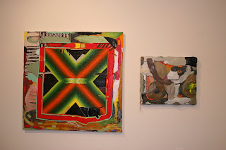
The stippled application of the paint mirrors the thick paint that appears in Paul Demuro’s paintings as well. Demuro’s work consists of extremely layered and sculptural paintings. The most intriguing piece to me is the purple painting that has the soft edges. To be frank, I could look at those paintings for a much longer, sustainable time then the paintings by Leticia Luevanos. I enjoy the indulgent aspect of the work; thinking about how much money and time it must have taken to layer that much paint is mind-boggling. Contrasting with that idea is the use of metallic paint. I enjoy the metallic paint because it reverses the ideal of the elite, indulgent aspect of the paint. It adds an aspect to the work that relates to some of the other works, like Marketa Klicova’s sculpture/installation. The paintings mostly deal with geometric patterns applied in a rough way through the extreme layering of paint. There is not much mixing of color, however, the paint is applied over and over until it can still alone as a painting and sculpture simultaneously. Demuro’s work made me debate the difference between sculpture and painting, and it blurs the line between the two very different processes.
Sunday, March 28, 2010
ZimZam
The Zimmerli Art Museum in New Brunswick, New Jersey has a small, strange, and interesting collection of paintings, photographs, and sculptures. Currently on exhibition in the Special Exhibitions gallery is Lalla Essaydi's "Les Femmes du Maroc". The title of the show came from Delacroix's painting Les Femmes d'Algiers. Essaydi confronts many issues surrounding European Orientalist paintings of the 19th century by staging reconstructions of the paintings (in my opinion, both sexist and racist paintings) in photograph form.
Lalla Essaydi's process involves complex steps, and begins with her inspiration painting, in this case, the famous Ingres painting, "Grande Odalisque". The impossibly long and seemingly boneless figure takes up most of the field, with her luminescent skin. This painting is said to be an Orientalist painting, because of the inclusion of what seems to be a hookah, an inclosed space primarily for women (known as the Harem), and the fabric covering her hair. Essaydi's opinion is that this is all fabricated and objectifying, and she wishes to re-establish the truth of her Moroccan culture. She takes this painting and about 10 others and sets up scenes that are similar to this. She creates sets that she draws on with Henna, a dark brown paste applied to women's bodies for celebrations such as weddings. Not only is all the fabric in the scene covered in Henna, but the women that are in the scene are covered in it as well, from head to toe. She utilizes a form of calligraphy that is mostly used by men, and controversially writes passages from her journals onto the skin and fabric. She also designs and makes all of the clothing that is worn.
The pictures are meticulously set up, photographed, and printed. The are all made up of a neutral color scheme of greys, browns, and flesh tones. She choses to leave the film border on the pictures, which reminds the viewer that they are looking at a photograph, and to not get lost in the hypnotizing henna. The series plays on the idea of the male gaze of the Orientalist inspiration paintings; being that she is a female artist taking photographs of mostly females that are not objectifying, she is making a statement about her culture. Instead of placing the women in a Harem scene, she places them on a stage-like interior space that she created. There are no men within the scene, and none of the women are nude. They all seem to be asserting themselves as strong women that are not defined by their sexuality.
The other photography currently on view is Out of the Ordinary: Photography by Larry Clark and Gary WInogrand. The exhibit starts out with more mild photographs of women by Gary Winogrand, and slowly transitions into heavier subject matter surrounding violence and drugs by Larry Clark (mostly from the series 'Tulsa'). It was interesting to see the combination of different genre scenes, from the mild to the grotesque. I had a hard time staying in the same room as some of the portraits, because they were so shocking. However, I enjoyed that all of the photographs were meticulously taken and printed; they all had the same size and format, which unified the different subject matter.
Lalla Essaydi's process involves complex steps, and begins with her inspiration painting, in this case, the famous Ingres painting, "Grande Odalisque". The impossibly long and seemingly boneless figure takes up most of the field, with her luminescent skin. This painting is said to be an Orientalist painting, because of the inclusion of what seems to be a hookah, an inclosed space primarily for women (known as the Harem), and the fabric covering her hair. Essaydi's opinion is that this is all fabricated and objectifying, and she wishes to re-establish the truth of her Moroccan culture. She takes this painting and about 10 others and sets up scenes that are similar to this. She creates sets that she draws on with Henna, a dark brown paste applied to women's bodies for celebrations such as weddings. Not only is all the fabric in the scene covered in Henna, but the women that are in the scene are covered in it as well, from head to toe. She utilizes a form of calligraphy that is mostly used by men, and controversially writes passages from her journals onto the skin and fabric. She also designs and makes all of the clothing that is worn.
The pictures are meticulously set up, photographed, and printed. The are all made up of a neutral color scheme of greys, browns, and flesh tones. She choses to leave the film border on the pictures, which reminds the viewer that they are looking at a photograph, and to not get lost in the hypnotizing henna. The series plays on the idea of the male gaze of the Orientalist inspiration paintings; being that she is a female artist taking photographs of mostly females that are not objectifying, she is making a statement about her culture. Instead of placing the women in a Harem scene, she places them on a stage-like interior space that she created. There are no men within the scene, and none of the women are nude. They all seem to be asserting themselves as strong women that are not defined by their sexuality.
The other photography currently on view is Out of the Ordinary: Photography by Larry Clark and Gary WInogrand. The exhibit starts out with more mild photographs of women by Gary Winogrand, and slowly transitions into heavier subject matter surrounding violence and drugs by Larry Clark (mostly from the series 'Tulsa'). It was interesting to see the combination of different genre scenes, from the mild to the grotesque. I had a hard time staying in the same room as some of the portraits, because they were so shocking. However, I enjoyed that all of the photographs were meticulously taken and printed; they all had the same size and format, which unified the different subject matter.
Friday, March 26, 2010
Soccer balls & Spray paint
Wendy White’s paintings deal with several different ideas, including the incorporation of ordinary objects in painting, the utilization of spray paint, the integration of text, and the placement of a series of paintings together to create a singular painting. After seeing many of her works during the Mason Gross School of the Arts presents: Artist's Lecture Series, I can see her graphic design influence and training, especially because of the way she paired her paintings with still photographs of her inspirations scrolling on the right during the presentation- most of them being sports and advertisement related.
Wendy White talks about the difference between beautifying something and painting on it; there is juxtaposition between creating beautiful paintings comprised of spray paint, masking tape, and soccer balls. The idea of using spray paint adds another dimension to the work; spray paint immediately dictates the rebellious act of graffiti, and that triggers the thought of text. She talks about using “text as a construction of image.” Consequently, the utilization of spray paint, masking tape, and text makes complete sense.
She thinks about the frame of the painting reflected in the framework behind the walls, and the construction or breakdown of the painting. Further adding to the breakdown of the artwork are the modular paintings that she makes. She purposefully paints on the moveable paintings to highlight the gaps in between the paintings and make it obvious that they are several canvases together. One might wonder what the back of the painting looks like and how it is constructed just from noticing the different panels. Furthermore, Wendy White talks about her inability to move her own canvases: a shortcoming that I too have had to deal with.
Joan Mitchell and I
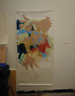
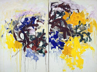
So the assignment was to make a response painting. I chose Joan Mitchell's Sunflower paintings, particularly the diptych painting. I really enjoy the brush strokes she uses, they're juicy and expressionistic (hence the inclusion of Mitchell in the ABEX movement). I wanted to capture those brush strokes and the freedom that she must have had to do these paintings, but by using house paints. The colors I chose are vaguely reminiscient of the colors she uses, but a little more fleshy and grey. I also wanted to play around with the composition. I found that it was un-necessary to do another painting because the composition of the one painting is satisfying enough. I also wanted to do the painting on paper. The feeling that the edges are peeling up subtly from the wall is completely different then paint on canvas... I might have to do a few more of these paintings. So, here it is!
Thursday, March 25, 2010
Playing 'Catchup'
It feels like I'm so far behind on the many things I wanted to say, so be patient with me. I've seen a lot of shows and heard a lot of things in the past month.. So much that I haven't had time to post. So here it goes...
Odili Odita's Artist Lecture
Odili Odita is a Nigerian-born painter that utilizes geometricized shapes of color painted on canvas and directly onto the wall surface. During the visiting artist lecture, Odita spoke of his color choice being personal colors that are used in order to trigger something in the viewer, like a memory or an emotion. This idea of universality of emotions is said to have began with Kandinsky and his use of abstraction; however, Odita utilizes space in a much different way. Being born in Nigeria, Odita is even more sensitive to presence of differences in societies, and drew from the inventions of televisions and computer as a source and inspiration. In particular, he spoke of the particular moment that a person turns on their television and sees everything and nothing at that same time; he utilizes the screen as a portal into other worlds, and his artwork as a statement that television is as subjective as art is. In his earlier works, it became obvious that he was focusing on color and utilized it to highlight subtle differences. Further on, he began to complicate his work by increasing the size and thus interacting the body within his work while complicating the weaving geometric triangles to form interlocking zigzags that made the composition more complex.
Some of Odita’s most interesting pieces are his wall paintings because it culminates his ideas more fluently and more concretely. The wall paintings could be done wherever there is a wall, and they are made specifically for a space. It feels like the wall paintings have more possibilities in composition and do not feel as limited, almost as if the canvas was not sufficient in holding his paintings, so he had to burst over them. The idea that his wall paintings are commissioned just for the space sums up his opinion on art, especially because he takes into consideration where the viewer stands, the openness of the space, the lighting, and the surrounding items in the space.
My favorite installation:
For more artworks, see Odili Odita's website:
http://www.odilidonaldodita.com/
Wednesday, March 10, 2010
Natura Morte
I find myself even more confused today then I ever have been with my paintings. Talking to people has made me feel more alienated in my frustrations. And I feel better realizing the history that has gathered behind me...
There is something deceivingly simple about the idea of the still life, something I have (until this point) refused to think about. Still lifes are not at all simple, they hold a history of symbolism and meaning, not only from the objects in them, but in the way they are painted. I find myself amused by the idea that when looking at a still life, you are looking at a captured moment of fresh fruit, as seen through the painter's eyes. Something about painting feels fresh, like it was just painted yesterday. This feeling is especially evident in the still life paintings of Chardin. These paintings are almost real-er then real.
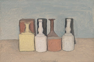
Maintaining a stage-like space similar to Chardin but completely different handling of paint is Morandi. I recently saw a Morandi still life at the Princeton Art Museum (by the way, an amazing collection that is obviously well-funded). The idea of painting only this banal genre scene and only these vases for his whole life is mind-boggling. The texture of his paintings is alluring, whereas they feel dry and wet at the same time. The brushwork feels effortless. Also in the museum were paintings by Cezanne and Soutine, two artists that have explored the idea of 'natura morta' and took it even more literally.
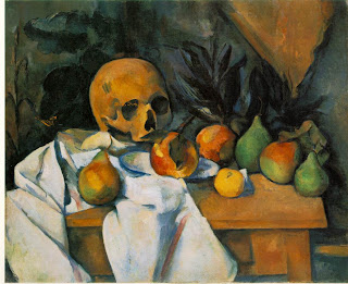
Cezanne puts a skull in the painting, referencing death and decay. He places the skull next to fruits, of which are eternally stuck in their bountiful ripeness. It is a visual juxtaposition that describes the imminent yet impossible death of the fruits. The skull is painted in what seems to be the same space and style as the fruits, which further emphasizes the juxtaposed items. Cezanne represents the epitome of the still life painters, and the objects that were chosen for the still life paintings determine the meaning of the painting, and that choice holds great importance.
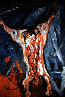
Furthermore, Soutine explores the idea of painting a splayed carcass of an animal, posing a question to the viewer: is that inside us too? The idea of painting a dead animal makes literal the idea of the still life. The idea of painting the gushing organs from an opened up carcass partially disgusts me. On the other hand, these paintings are beautifully painted in a shade of red that doesn't make me gag. Seeing a painting like this hanging next to a landscape or a still life makes me think of the acceptance and willingness from the viewer to see something in a museum that could possibly be disgusting or revolting.
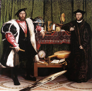
Hans Holbein paints an aristocratic portrait called "The Ambassadors," while keeping a hidden secret (that is distractingly obvious after revelation) that reveals an anamorphic skull. This painting has been extremely studied, in fact, I'm sure every into to art history has mentioned it. The only way to view the skull would be either tilt the screen or paper that is in view, or in person to basically get down on the ground and look at the perfect angle. It's a strange painting because it feels like a common portrait with still life items surrounding it, and yet, there's this obsession with the stopping of time and death that becomes obvious upon the realization of the skull. Unfortunately, after that realization, there is no other way to reconcile the image of the skull, hence my brain constantly is trying to put together that image.
This leaves me feeling somewhat comforted after linking together only several of the infinite artists that inspire me on a day to day basis, while solidifying even more the idea that I do not want to paint really-real paintings of fruits or vases, not even potraits. Although it has worked for this artist, there are limitations to how much a viewer can take out of paintings like say, Holbein's "Ambassadors".
Wednesday, February 17, 2010
"What we see never resides in what we say."
I'm sure every person that has taken an intro to art history class has studied this painting, and thought about it in a general way. Before I read Foucault's article, I did not think about the space of the painting, what is hidden by the canvas and the mirror, the revealing window lighting on the right-hand side, or even the extremely classical composition of the painting. I begin to realize that I was trained to look at paintings and solely describe subject matter as it relates to history, and that is why I am finding it absolutely necessary for me to look past subject matter and simply describe.
Something I find so puzzling and interesting about this painting is that the viewer takes the position of the sitter; however, simultaneously reflected back at the viewer is the reflection of a couple (in place of where the viewer stands). This makes me question the truthfulness of the reflection, and makes it even more apparent the feeling that we have never or ever will, see with our own eyes our own face.
Foucault describes several rhythms to the painting, and how the composition of the painting is lyrical. The left-hand side of the painting is mainly taken over by the back of a canvas that appears as if it could over-take the artist. The artist stands in the pause between placing his first stroke or his last stroke (the viewer will never know which it is). This effect, that Foucault compares to the mid-swing of a pendulum, is repeated in the background, where a man is either about to leave or enter the room. The mirror, which at first glance passes for one of the other salon-style paintings that hang from and cover the wall of the artist's studio, glows with iridescence, thus giving it away as a reflective object. It hangs immediately to the left, lining up perfectly with the top of the opening of the doorway. The figures in the scene are painted with extremely loose brush strokes, that keep as much detail from the viewer as possible from close up, similar to the curious effect of the back of the canvas from far away. The idea of the self-portrait of the artist has its roots in antiquity (though it is more difficult to prove because of a lack of signature, until Donatello in the Italian Renaissance, 14th c.), and artists including but not limited to Jan Van Eyck, Ghiberti, Rembrandt, and Michelangelo (he completed several self portraits, one that is arguable in his Last Judgement at the Sistine Chapel and at least another in his sculptures).
I cannot seem to get past the space that is created by the lower half of the canvas, the space that is occupied by the 'infanta'. It glowingly reveals an atmospheric space in which I can almost feel the air; the space is so real that it looks as if I could walk right into the painting. I have not had
the privilege of standing in the presence of this painting, but from seeing fragments of the painting in great detail, I could see how that space just dissolves into the wet brush strokes that have no hard edges or clear definition. This double-experience painting is probably similar to standing in front Monet's Water Lilly paintings, from several centuries later.
Foucault's language in the article moves in the same slow motion of Las Meninas. Though the subject matter is concrete in describing the moment of the viewer as the sitter, it is the areas that are slightly blurred that are the most interesting, and are revealed through slow observation by the viewer. Still, I cannot seem to describe in full the experience I have when looking at Las Meninas, as well as other paintings; I find that words cannot even touch something that I sense in such a different way.
Michel Foucault, from "Calligram" edited by Norman Bryson, Cambridge University Press
Diego Velazquez, Las Meninas, 1656
Claude Monet, Water Lilies, c. 1920
Tuesday, February 9, 2010
Snow
I finally have a chance to breath because of a snow day... very exciting. So I'm updating my blog finally!
I completed a detailed sketch of Johnny Cash for an upcoming commission in graphite on paper.
Other then that, I will admit, I've been slacking in my production. I have been researching an extensive amount of information, and have been contemplating intensely my art. But contemplating does not yield anything tangible, unfortunately...
Sunday, January 10, 2010
Saturday, January 9, 2010
Hall of the Muses
Also known as the Museum... a place to display art, particularly paintings, drawings, and sculptures-sometimes installations. A silly, yet completely logical concept. I wonder what my life would be like without these architectural features. Yet all of this thinking about museums and muses led me to thinking about my own inspirations...
Music plays a huge role in my art-making. I feel like I have to be listening to music or else I can't create - it's that simple. I'm always looking to find new and inspiring music, but sometimes the classics can do it for me...
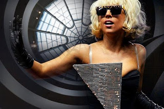
Right now, Lady Gaga is my muse. She's crazy and fabulous and I love it.
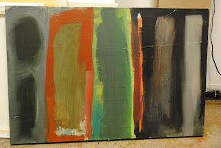
I'm hoping to eventually do a painting inspired by her. But for the time being, I'm more interested in abstraction. I'm currently working on several series, experimenting with a few different types of painting in preparation for my thesis next year.
The painting that started it all was a text-based painting that was born from a landscape, and then I turned it on it's side to make it a text-based abstract painting. If you look closely enough, you'll see that it says 'BOOM'... I say that with some regret because once I mention the text, you cannot see much beyond that, and you will be stuck making the word. Maybe eventually I'll make a GAGA painting...
The other series I'm doing is a series of commissions-they are all realistic paintings. I do not get the same gratification from them as I do from my abstract paintings.
Currently, I'm working on some 'found' paintings that I've painted on... there will be more to come about those paintings.
I'm in the process of gathering materials to make a book based on my inspirations. Including the miss Lady Gaga and the many artists that I look to for inspiration.
Sunday, January 3, 2010
Recent Paintings, 2009
So this is happening at the end of a decade. A decade full of disappointment, recession, and decreasing hope. In an attempt to combat the inevitable, I find myself thinking and creating. Though such deep thought might be my curse, I have this need to create.
This is my first real attempt at abstraction. As I delve deeper into this painting style, I'm realizing that it is the most difficult type of painting. I feel like painting realistic is almost a cop-out for me, while abstract painting is just more challenging and ultimately more gratifying. This is partially because I'm beginning to realize no matter what the subject of the painting is, that there is no solid point to which an artist knows that the painting is 'finished'.
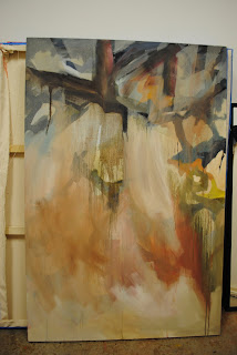
I created this layering effect by painting over a previous less successful painting. The areas that I taped off and painted over are still somewhat visible. The original painting was a study of a sunset I had observed over a year ago, and I still believe it has a feeling of light similar to that of a sunset.
Abstraction interests me because I feel like there are different levels of abstraction. Since art is so subjective, it is hard to determine those levels, and the lines are then blurred in-between. I could create a painting that has a solid subject, but is so skewed through different techniques that the viewer perceives the painting as abstract.
So, this is the beginning.
Subscribe to:
Posts (Atom)